Doha infographic gets the numbers wrong, underestimates human emissions
Doha infographic gets the numbers wrong, underestimates human emissions
9 septembre 2021
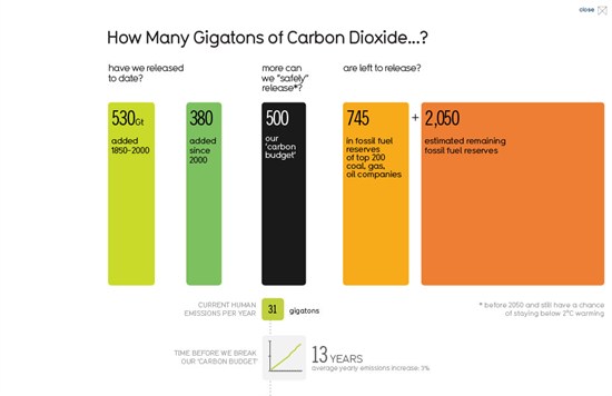
There’s a startling infographic on the Guardian’s datablog today from designers Information is Beautiful. Timed for UN climate talks in Doha, it presents some top-line numbers about human-caused carbon emissions, followed by a whole page listing potential impacts of climate change according to temperature rise.But one of the key top-line figures is wrong, and several others are confusingly presented – so we’re happy to report that the graphic is being revised. [Lire plus]
Vous lisez LMC.today gratuitement. Ce travail de veille, de tri, d’analyse et de mise en cohérence existe grâce aux soutiens. Le soutien au projet ne coûte que quelques centimes par mois.
Vous pouvez continuer gratuitement. Vous pouvez aussi lire sans interruption.
Pourquoi cette fenêtre ?
LMC.today est librement accessible, mais libre ne veut pas dire sans coût. Derrière chaque fiche, il y a des milliers d’heures de recherche, d’écriture, de classement, de mise en forme, de développement et de maintenance.
Cette fenêtre sert donc à rappeler une chose simple : si ce travail vous est utile, vous pouvez aider à le faire vivre.
LMC.today reste accessible à toutes et tous. La contribution ne vend pas l’accès au site : elle désactive simplement cette fenêtre de soutien pendant la durée choisie.
Pour activer la lecture sans interruption :
Cliquez sur le bouton Tipeee ci-dessous.
Sur Tipeee, choisissez une contrepartie : 2 €, 6 € ou 20 €.
Après validation, Tipeee vous envoie le lien d’activation LMC.today.
Vous indiquez votre email : l’accès est activé localement, sans compte WordPress.
Important : un tip libre soutient le projet, mais n’active pas la lecture sans interruption. Pour recevoir le lien d’activation, il faut choisir une contrepartie Tipeee.
Sur Tipeee, sélectionnez bien une contrepartie. Le lien d’activation sera envoyé automatiquement dans le message de la contrepartie choisie.
Vous avez déjà contribué ? Utilisez le bouton ci-dessous pour restaurer votre lecture sans interruption avec le même email.
Aucun accès n’est restauré par simple saisie d’email : un code est envoyé à l’adresse concernée.
Problème d’activation ? Expliquez votre situation. Les soutiens récurrents sont traités manuellement.
La vidéo explicative semble bloquée.
Votre navigateur, un bloqueur de publicité ou une protection anti-pistage empêche YouTube de se charger. LMC.today reste accessible, mais ce travail dépend du soutien réel de ses lecteurs.
Module d’accès bloqué
Votre navigateur ou une extension empêche LMC.today d’afficher le module d’accès aux fiches. Ajoutez lmc.today aux sites autorisés dans votre bloqueur de publicité ou votre protection de confidentialité, puis rechargez la page.
Nous utilisons des cookies pour vous garantir la meilleure expérience de navigation sur notre site web, aucun d'eux n'est intrusif, nous ne sommes intéressés par aucune donnée personnelle.